
Take Life One Cup At A Time
take the quiz! It only takes a minute - promise! >
Hey girl! What's Your Signature Latte? Whether it's a frothy latte or a cold brew, your personality shines through. Find out what your java ingredients are!

shop my instagram
LIKEtoKNOW.it


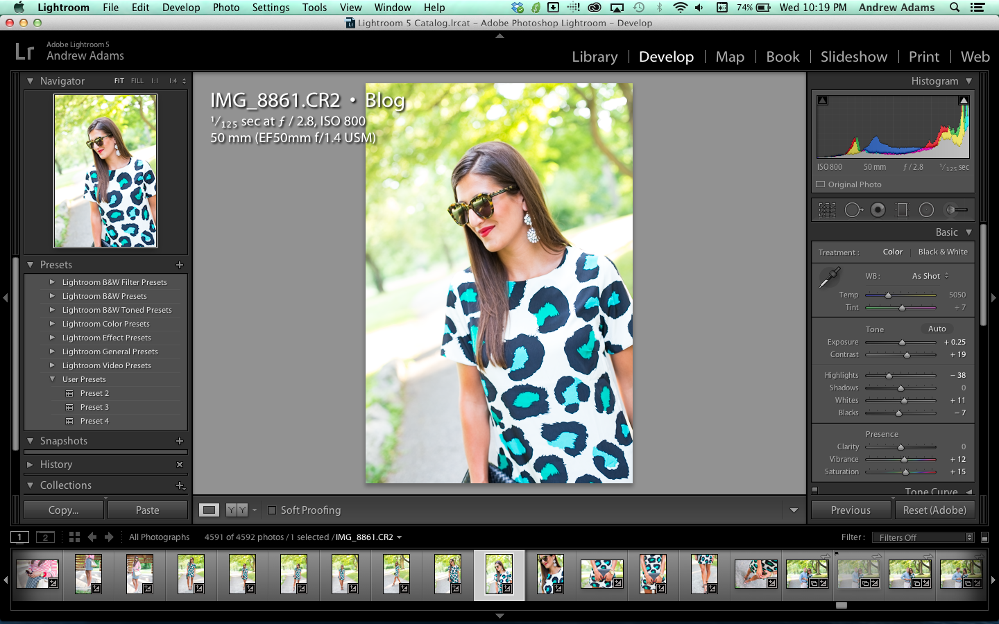
Photo Tip Thursday: Photo Editing Workflow
This week I thought I’d show you the workflow that I go through to edit outfit photos. There’s several basic adjustments that need to be made to a photo shot in RAW before you export them to be seen on your blog. I personally use Adobe Lightroom, but the terminology/settings {such as exposure, saturation, highlights/shadows} should be universal among applications so if you have Photoshop Elements, Camera RAW, or any other application, you should be able to make these exact same adjustments in these programs as well.
Let’s begin.
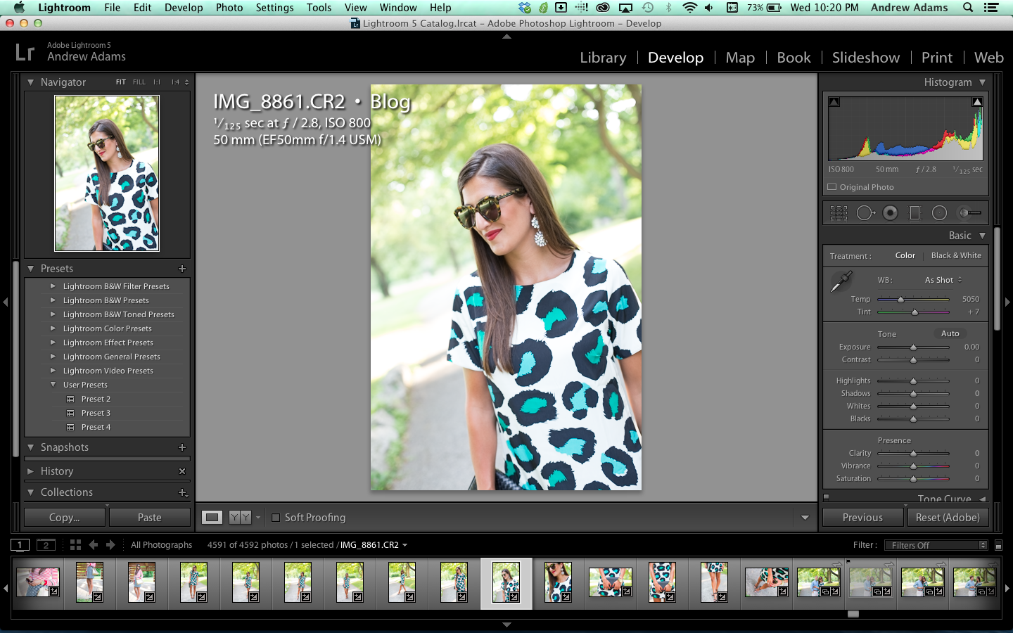 |
| This is the original RAW image from the camera with no adjustments applied to it. |
1. Exposure:
This one’s pretty basic. It has to do with the brightness of the image. If the image is too dark, move the exposure to the right to increase the brightness. If it’s too bright, move the slider to the left to decrease the brightness. Just make sure the levels of light look natural on your subject. You want to be able to see all the detail in their outfit as well as in their accessories while making sure that their skin tone looks natural.
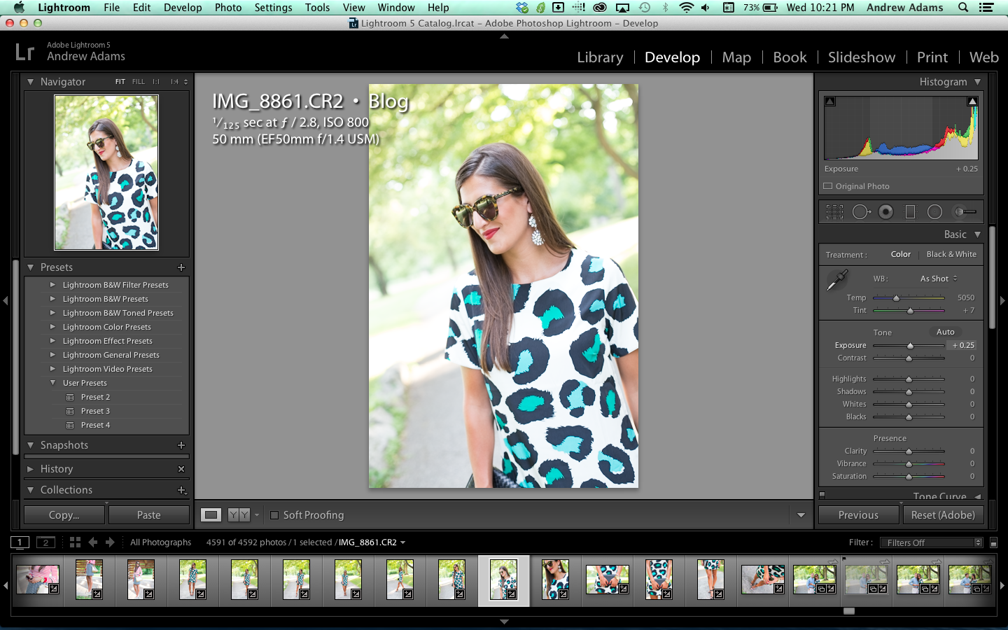 |
| The original photo was a little dark, so I increased the exposure just a bit to bring out more detail in the photo. |
2. Temperature {White Balance}:
Image temperature has to do with the levels of blues/yellows in your images. Images that are more warm have more yellows. Images that are more cool have more blues in them. Base your adjustments in this realm on your subject’s skin tone. If the skin appears too warm {it has a yellowish/orange tint}, move the slider to the left to decrease the temperature. If it’s too cool {it has a bluish tint}, move the slider to the right to increase the temperature. Just make it look natural.
|
| Luckily the temperature of this image was spot on so no adjustments were required. |
3. Contrast:
Contrast increases the differences between the light and dark areas of the images. Increasing the contrast tends to bring more definition and detail into the finished image. RAW files naturally have much less contrast applied to an image than one in JPEG format would, so you have to apply this yourself. Move the slider to the right until there is more definition between the shadow and highlight areas of the subject and their outfit. Once again, make sure it looks natural!
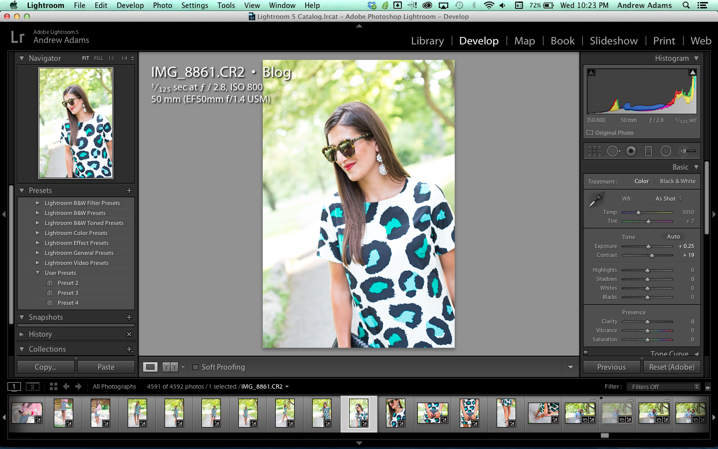 |
| Increasing the contrast made the lighter areas of the image lighter while darkening the darker areas. This adds more detail and definition to the photo. |
4. Highlights/Shadows
The Highlights are the extremely bright/light colored areas of an image. The Shadows are the extremely dark/dim areas. Move the “Highlights” slider to the right to decrease detail {make them brighter} in the highlights, and to the left to increase highlight detail {make them darker}. Move the “Shadows” slider to the right to increase the detail {make the shadow areas brighter} seen in shadow areas of the image, move it to left to decrease the detail {make the shadow areas darker} in them and make them less pronounced.
 |
| I decreased the “Highlights” to bring in more detail not originally visible in the brighter areas of the image. I did not touch the shadows slider because I felt that the level of detail was adequate in the shadow regions and that they were not overexposed. |
5. Whites/Blacks
The whites slider adjusts how “white” the whites look and the black slider adjusts how “black” the blacks look in the image. With the “Whites” slider, move it to the right if you want the white areas in your image to appear brighter. Conversely, move it to the left if they are too bright and you want them to appear dimmer. With the “Blacks” slider, move it to the right if you want to lighten up the black regions of your image. Conversely, move it to the left if they are overexposed and you want the black areas to appear…well, more black and darker.
 |
| I increased the “Whites” slider to make the whites in the image a little brighter. It really makes the whites “pop”. |
 |
| I decreased the “Blacks” slider just a bit to make the blacks in the leopard spots stand out a little more and look more black. |
6. Vibrance/Saturation
Vibrance and saturation both increase the amount of color in an image. They make the greens look greener and the yellows look more yellow and so on with each color. The only major difference is that the vibrance slider is much more subtle than the saturation slider. To begin, first move the “Vibrance” slider to the right. This mainly increases the levels of colors of everything but the skin tones. Next, move the “Saturation” slider to the right if you want even more color {including skin tones}. This increases the levels of colors in EVERYTHING! Be careful! Increasing the saturation too much can make the skin tones look orangish. Take care to avoid this.
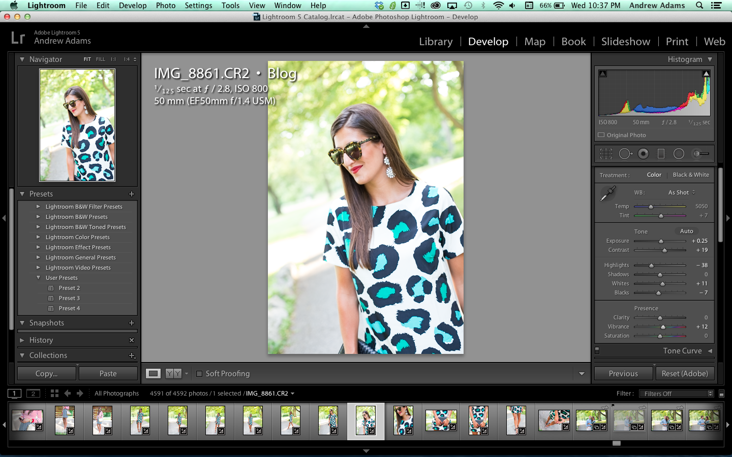 |
| By moving the “Vibrance” slider to the right, I increased the amount of green in the trees and turquoise in the leopard spots without affecting the skin tones too much. |
 |
| By moving the “Saturation” slider to the right, I increased the amount of colors in EVERYTHING {including the skin tones of the subject}. Take care not to go overboard when increasing the saturation as it will make the skin appear an unnatural yellowish/orange tint! |
Leave a Reply


Become a healthier version of yourself by joining the FITwithASD community today! For only $8.99/month or $89/year, you never have to worry about workouts, macros, or a meal plan again.
learn more about fitwithasd ⟶


shop my instagram
LIKEtoKNOW.it
The All-Time Favorite Posts

read this post
⟶
Personal
10/27/18 Mr. & Mrs. White
There’s not a day that goes by when I don’t feel so blessed to be Jordan’s wife. He is my everything. These photos and video are the sweetest reminder of our love for one another. So, grab a cup of coffee, pull up a seat, and try not to bawl your eyes out (because I know we did). Every time we look through our photos and watch our video, we cry the happiest tears.


read this post
⟶
Personal
The Proposal
It’s crazy what can happen in a year. I met the love of my life and the rest is history. I was having a hard time ending this post, because frankly, I think I could talk about that evening forever. Then I realized that this post doesn’t have an ending, but instead, a beginning. Thank you so much for all of the love, excitement, and gratitude.


read this post
⟶
LIFESTYLE
Dark Chocolate Chip Pumpkin Bread
One of my favorite things to do in the fall is bake my dark chocolate chip pumpkin bread! I’ve made it *so* many times for me, J, and friends & family. It’s moist, decadent, and super easy to make! It also makes for a great DIY housewarming gift.


Thanks for sharing! I love these tips!
The Style Storm
<3, Christina
I love all of your tips! Can you do something on blurring the background ? Do you edit that in or accomplish it by adjusting the f-stop? I am still struggling with this! Thanks again!
Just started following you on ig! Wowza! Love all the information and gorgeous pics. I was hoping to get some advice on a up and coming computer purchase. If you can share what type of computer you use that would be great. We are simply using ours for social media, editing pictures, writing and so on. Appreciate any suggestions.